
Picking a pleasant colour palette remains a challenge, even at companies with a design department.
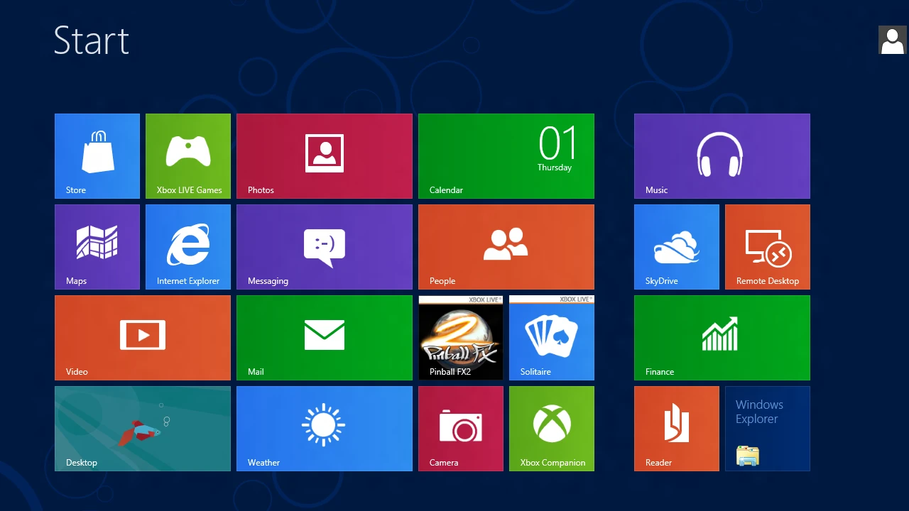
The start menu introduced with Windows 8. In my informal survey, none of the tile colours were found pleasant.
Let us see:
- Default colour spaceWhy that happens
- Perceptually uniform colour spaceA perception-based solution
- Opponent-process colour spaceAn opponent-process-based solution
- Physiological colour spaceA physiology-based solution
- Kamil’s colour spaceHow we combine them into a better colour system
Ultimately, colours are encoded on computers with 3 components, called (imprecisely): red, green, and blue. These colours are not psychologically pure, but rather a wavelength easily emitted by pixels. Here is the simplest hue picker following that model (called HSL) :
You can notice how the hue is not linearly uniform: there are wide swathes of the same green and blue; and narrow but visible swathes of yellow, magenta, and cyan. This leads some designers to favour them, while there are a bit aggressive:
There are much better spaces for our purpose, called perceptually uniform. The goal is to be uniform in the eye of the human, instead of the computer. A recent example is Oklab (luminosity and chroma at 80%):
The hue gradient is more visible. It yields the following palette:
What has happened? We have lost the primary colours, and are left with lavender, electric pink, orange, olive… The unfortunate colours of the start menu. We can assume the designer wanted a palette that maximised accessibility, with a constant luminosity, at the cost of aesthetics. Indeed, luminosity is part of the essence of a colour; yellow is the brightest, for example. And a dark yellow is more ugly because it distorts that essence. What about an essentialist approach?
Some colours cannot be mixed: while we can imagine a green yellow, we cannot imagine a green red. That is the basis of the opponent-process colour theory:
The opponent process is a color theory that states that the human visual system interprets information about color by processing signals from photoreceptor cells in an antagonistic manner. The opponent-process theory suggests that there are three opponent channels, each comprising an opposing color pair: red versus green, blue versus yellow, and black versus white (luminance).
By asking people “what is red?”, “what is green”, it is possible to find the hue of psychologically pure colours. The Natural Colour System is an example:
Finally, beautiful colours!
You can find a theoretical explanation of the reason why simpler, pure colours are more pleasant here.
However, a deeper investigation reveals that the space is not uniform:
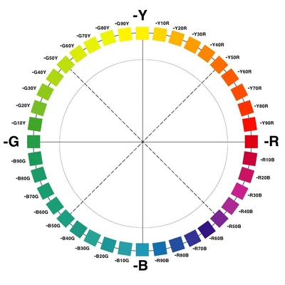
The bottom-left quadrant changes slowly, while the bottom-right changes quickly. Unfortunately, spaces usually do not put hues at the right angle in the colour wheel. Except for rare perceptually-uniform spaces (like CAM16-UCS), most spaces with a data-based approach (like Oklab), are erroneous because their hue data is not perceptually uniform (Munsell for Oklab hues). So, how can we find the angle of a colour? What should be the blue on the opposite side of yellow?
This problem has defeated the brightest designers, who use suboptimal colour spaces. How can we solve it? The simple but brilliant solution comes from the paper The colour wheels of art, perception, science by Nick Harness:
Having observed a colour (visual stimulus), particularly a highly chromatic one, on an observer looking away from it an after image is perceived, not of the colour itself but of what may be considered to be its complement […]. I began with the pure NCSs visual yellow S 0580-Y. After staring at this colour for 15 s then turning away and looking at a white background, I experienced an after image of a red tone blue which I identified as S2565-R80B. To check this assessment I placed the two colours next to each other both on a white background. After staring at these for 15 s I was able to visually drag the complementary colours away from each colour and could check this visual colour experience against the original colours.
Using this technique, we can produce the following palette:
Finally, can we combine the advantages of these colour spaces?
Kamil’s colour space- We still encode pure hues at reference angles, like the RGB colour space.
- To know which hue to select, we use Mr Harness’s physiological process.
- To find the proper luminosity and saturation for a hue, we look at the data from the Natural Colour System
- To interpolate between pure colours, we use a perceptually uniform space: a combination of CIELAB for luminosity and CAM16 for hue called HCT.
By increasing/decreasing the luminosity by half (still in the HCT colour space), we can also get brown at 45°, pink at 0°, pastel blue at 225°, etc.